Portfolio of Work
Below I present samples of my work.
The majority are submissions from courses taken for the MS-GIST and Economics PhD degree programs at Georgia Tech.
Maps
Map Samples
Below I present maps I have made during my studies for various lab submissions and while completing MOOC courses.
You may click on the images to read details and see the images in full.
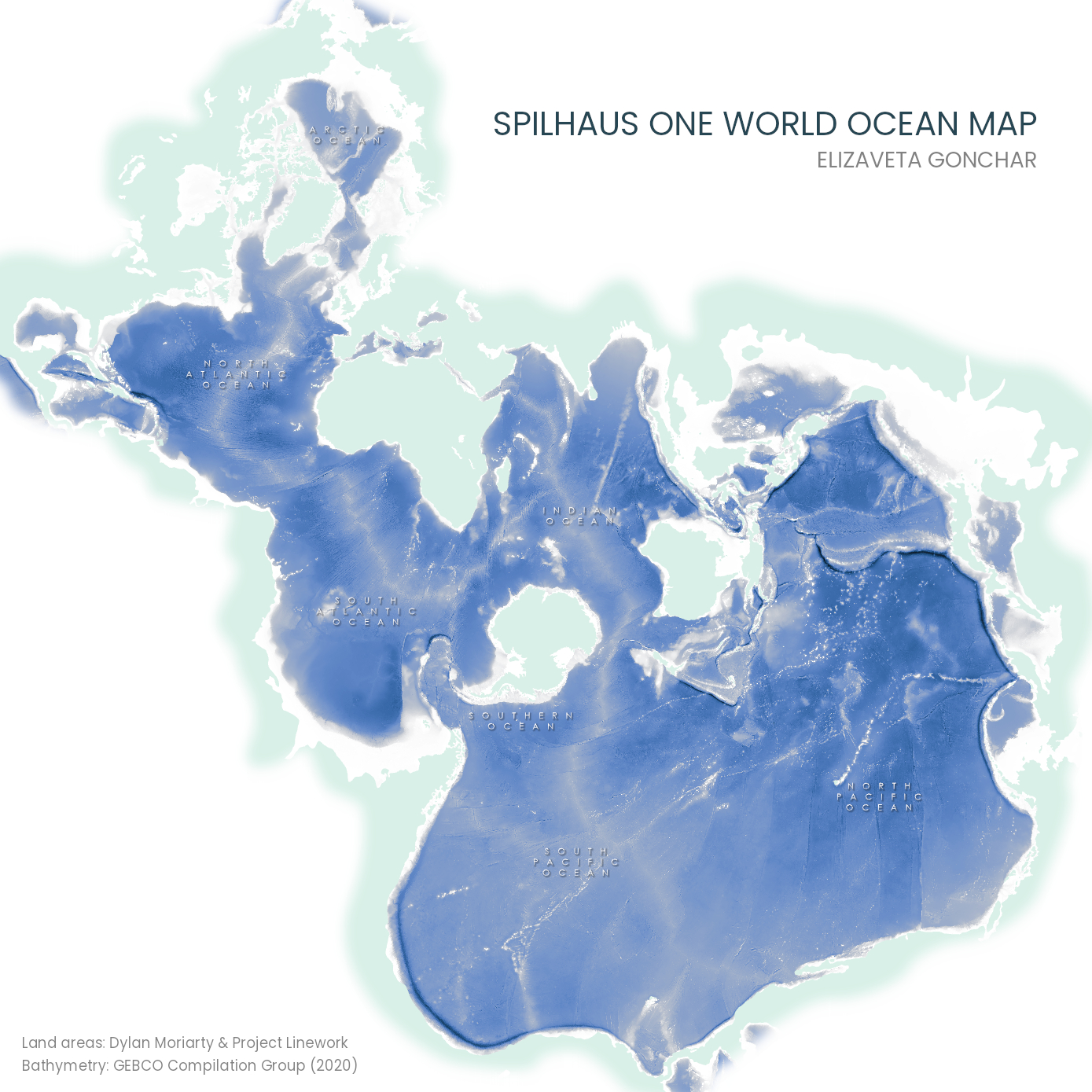
Map of the world’s oceans using an ocean-centered projection.
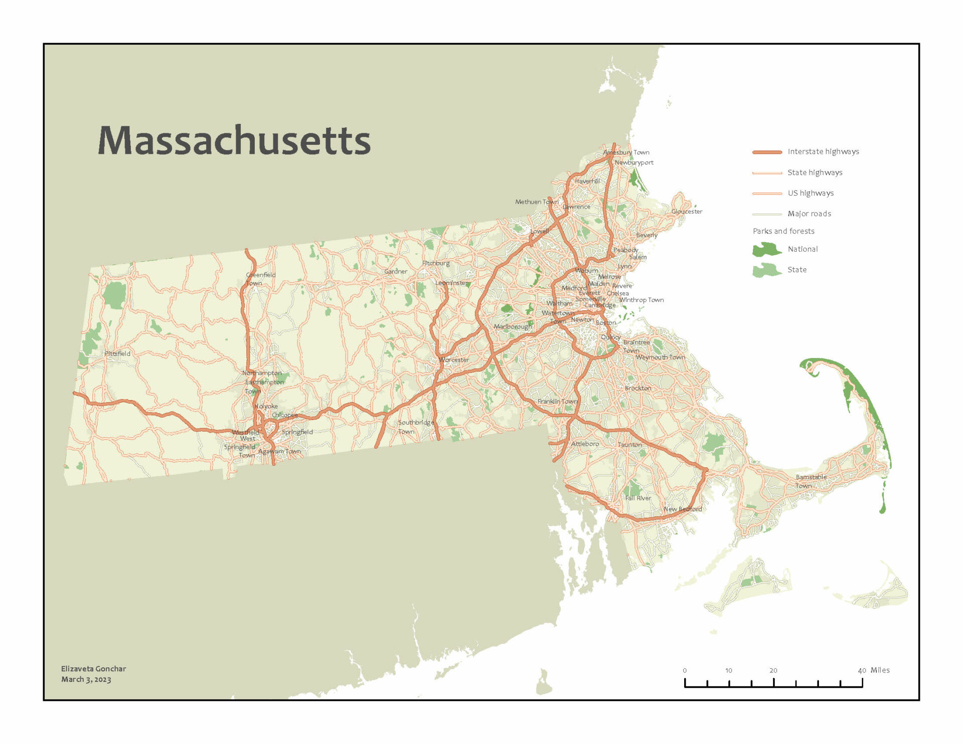
Small-format reference map of the U.S. state of Massachusetts.
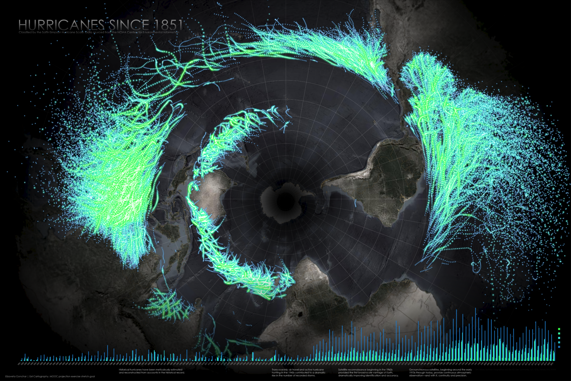
Shows the locations of each recorded hurricane and tropical storm since the mid 1800s. Map is a replication of John Nelson’s work and was done as a stretch goal for a MOOC exercise.
Identifies areas of the United States that are suitability for growing kudzu.

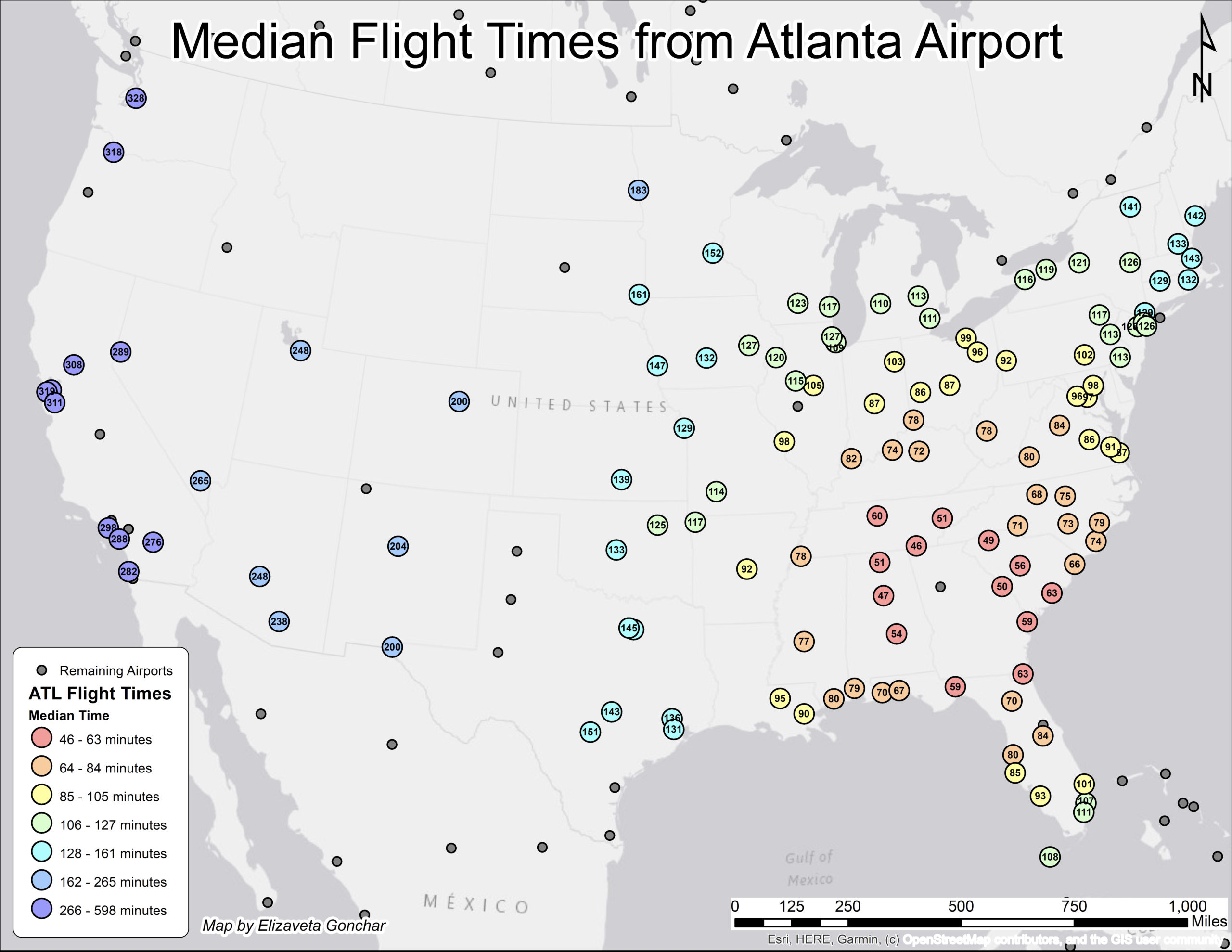
Presents median flight times for flights from the Atlanta airport.
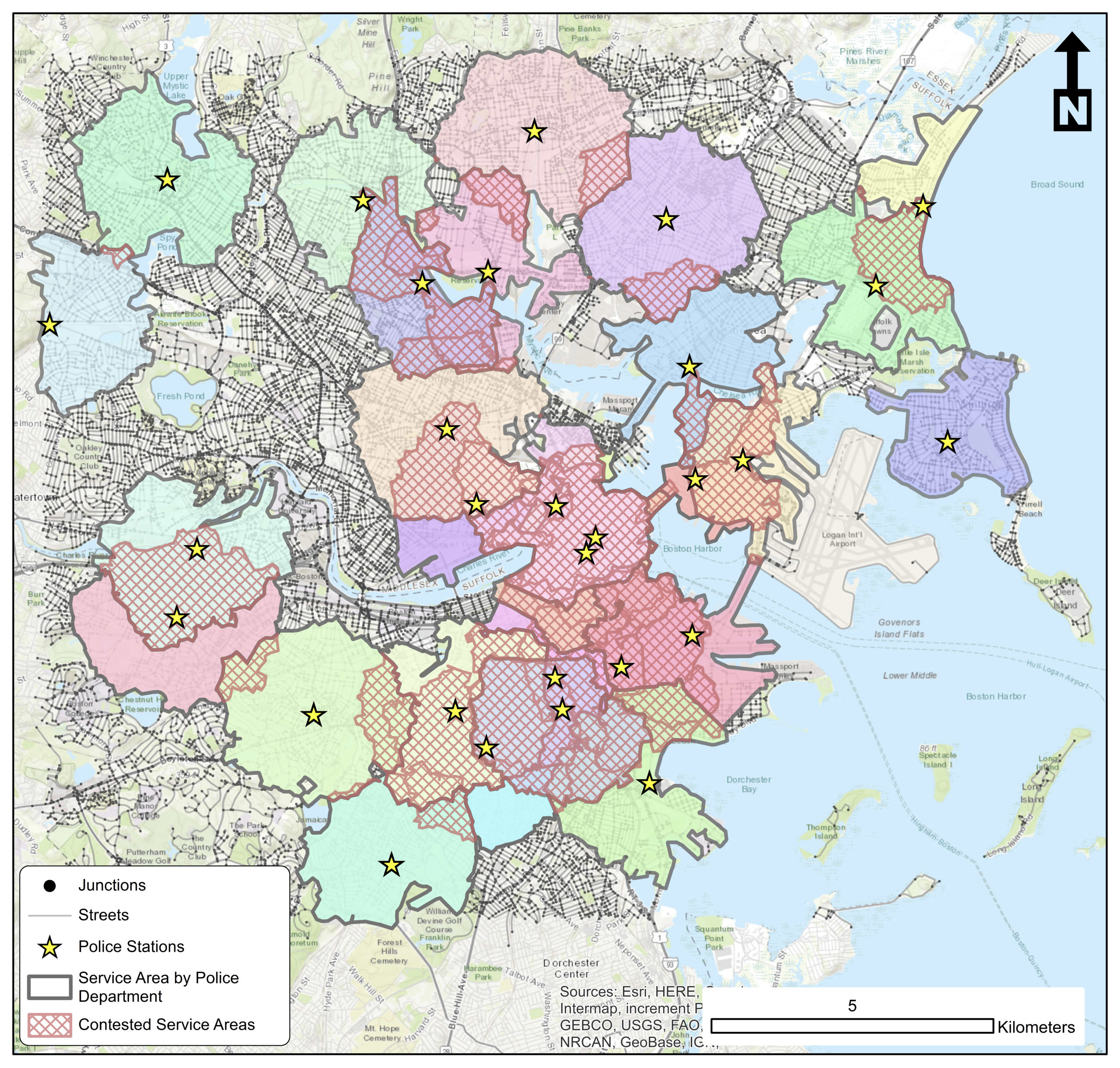
Service areas of police departments in Boston, Massachusetts. Note: College-affiliated police departments not included.
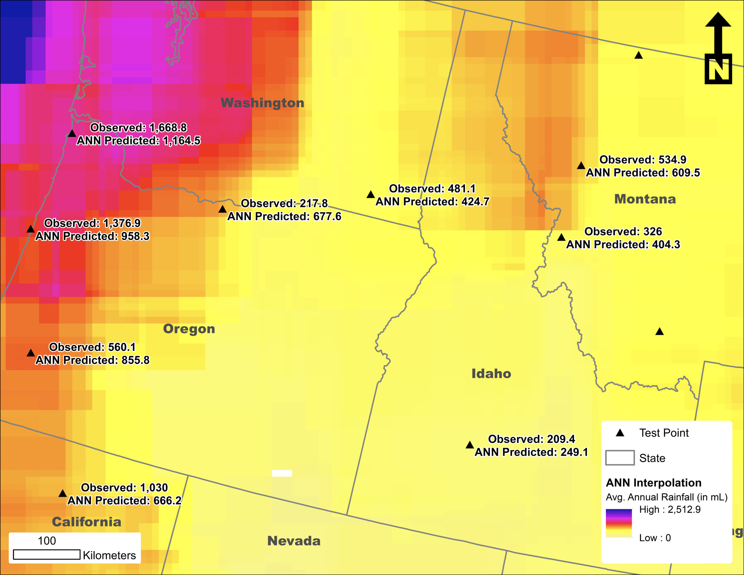
Annual rainfall predictions for the Northwest region of the United States. Here I used the average nearest neighbor method for the interpolation.
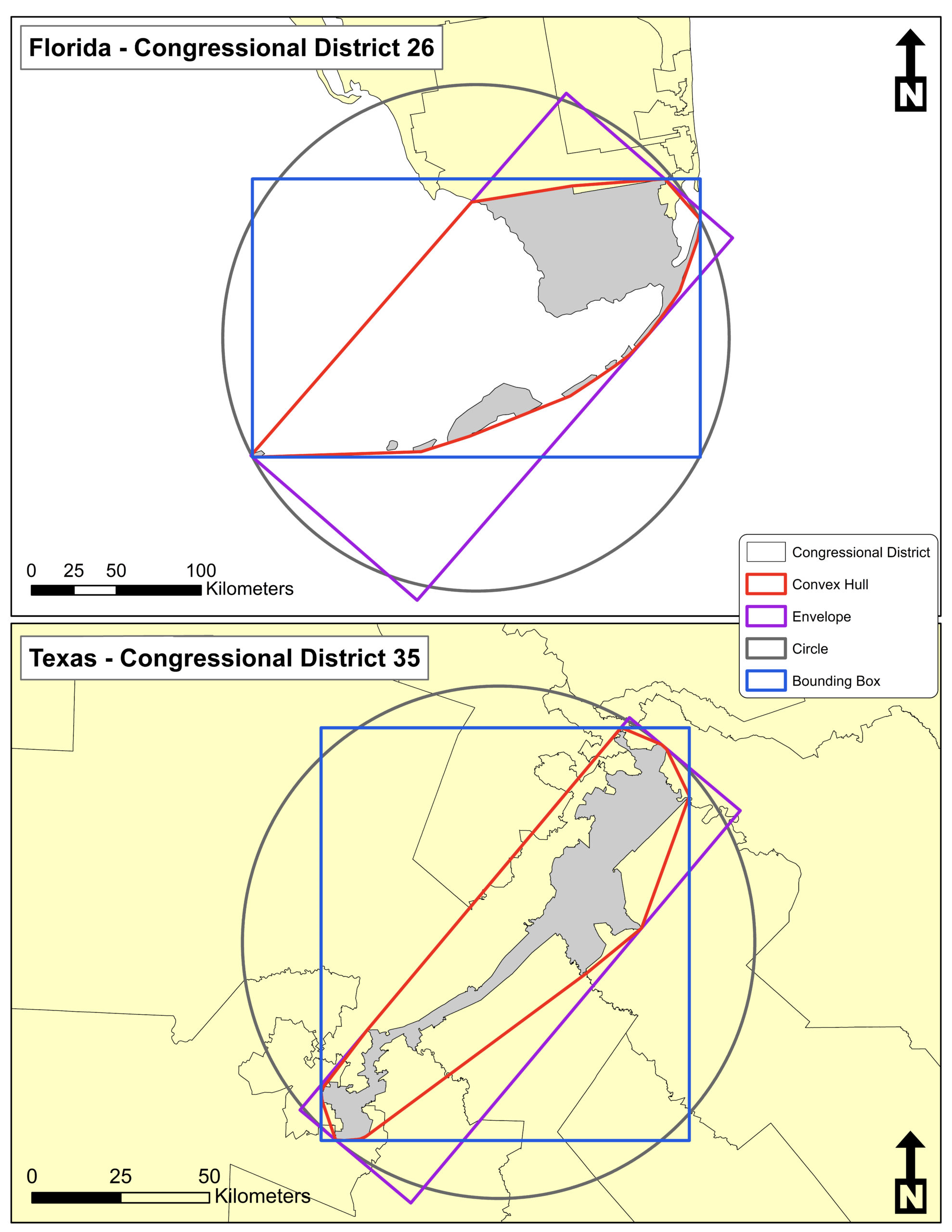
This map highlights two U.S. districts that perform poorly on the four compactness metrics that are referenced when discussing gerrymandering. (For this assignment, we were asked to exclude Illinois districts from our consideration).
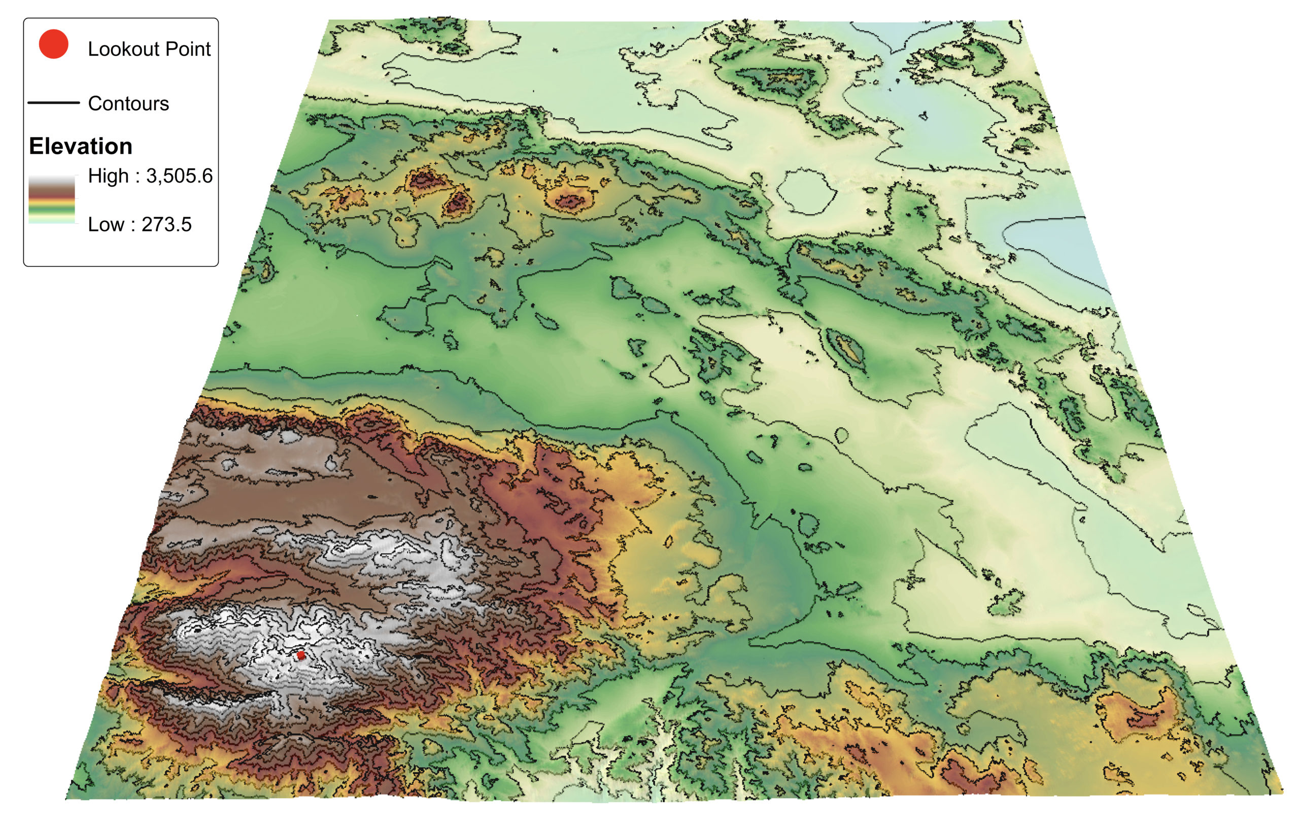
A 3D map using DEM of Joshua Tree National Park with contours.
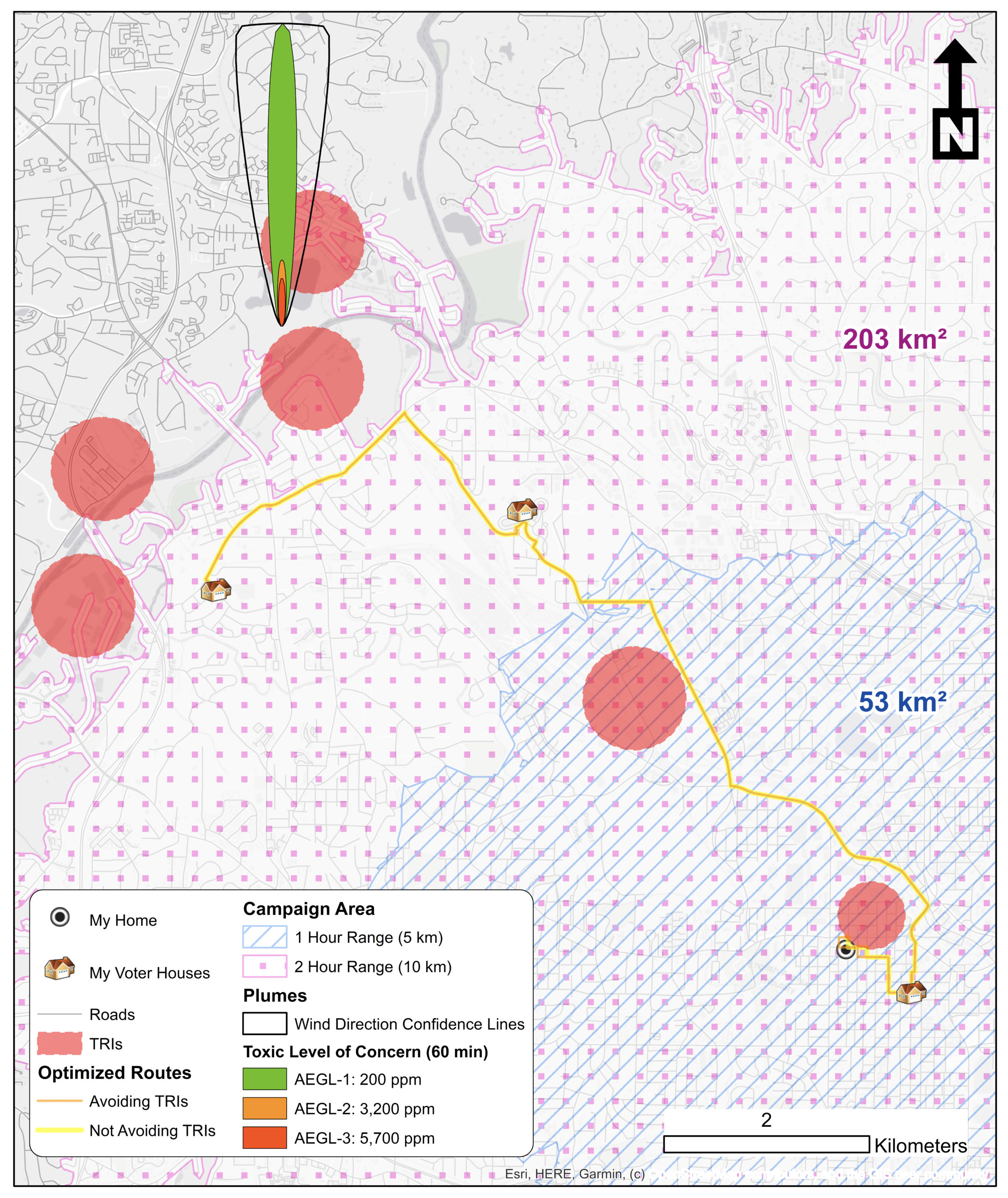
In this map, I model the network cost (travel cost), delineate service areas, and highlight the route identified to avoid hazardous areas (TRIs and their plumes). The task required picking a starting location at random, identifying the voter houses you could campaign to within a 1- and 2-hour range, and calculating the optimal route. Then we computed an optimal route that avoided TRIs (in this case, the two routes were similar).
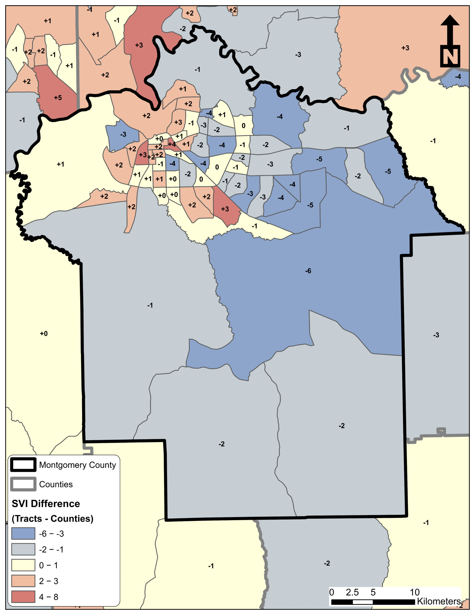
Comparing the Social Vulnerability Indices (SVIs) of tracts within Montgomery County, Alabama to the SVI computed for the entire county. This map provides evidence that there is significant variability in vulnerability within a county.
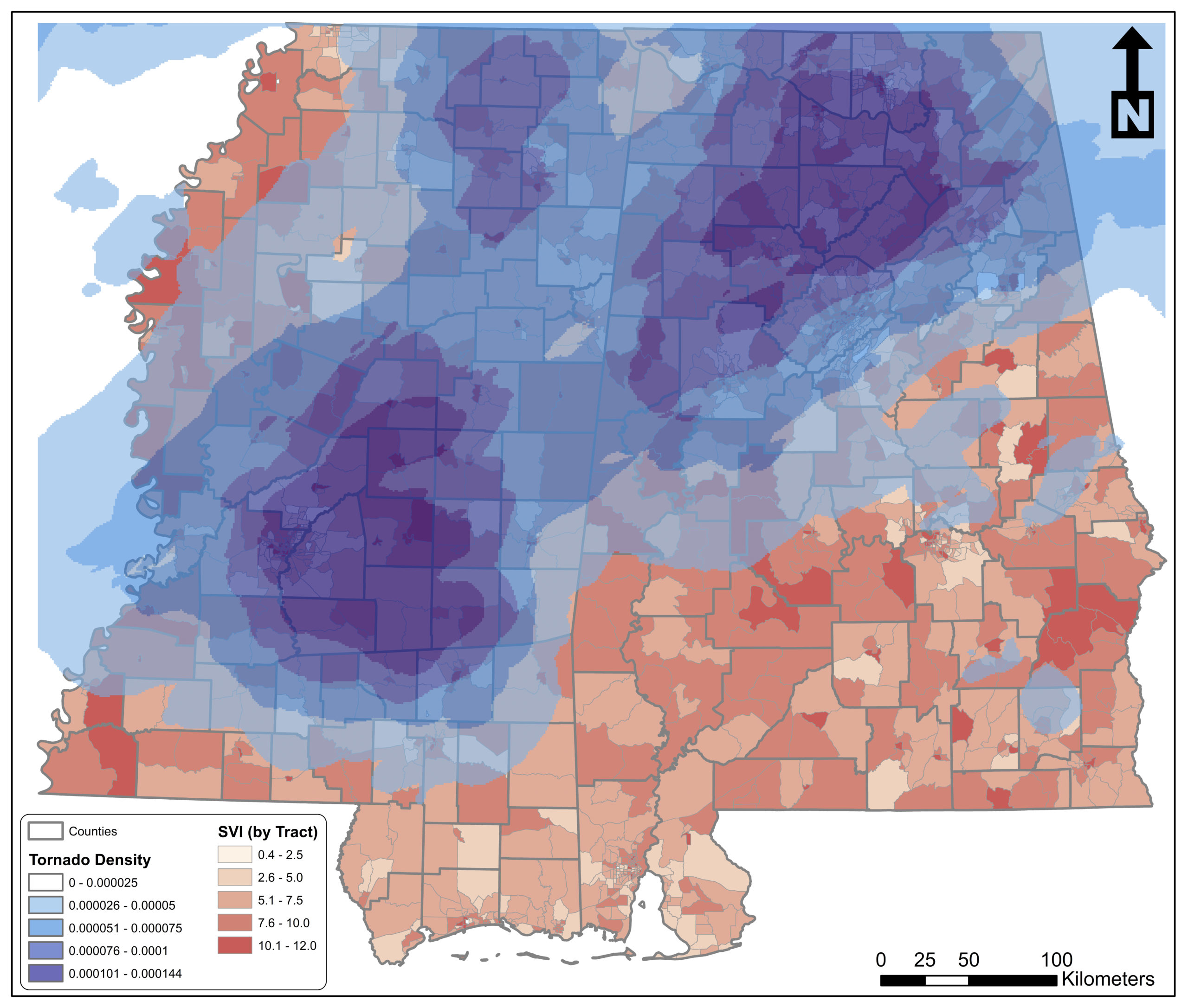
Map of tracts for Mississippi and Alabama symbolized by Social Vulnerability Index (SVI) with a tornado density raster. From the figure, we see that there are three sections of the study area that were most frequently hit by tornados (northern Alabama, northern Mississippi, and central Mississippi) as indicated by the dark blue patches of tornado density. From a visual inspection, it appears that many of the vulnerable tracts are located outside the areas that exhibited relatively high tornado densities.
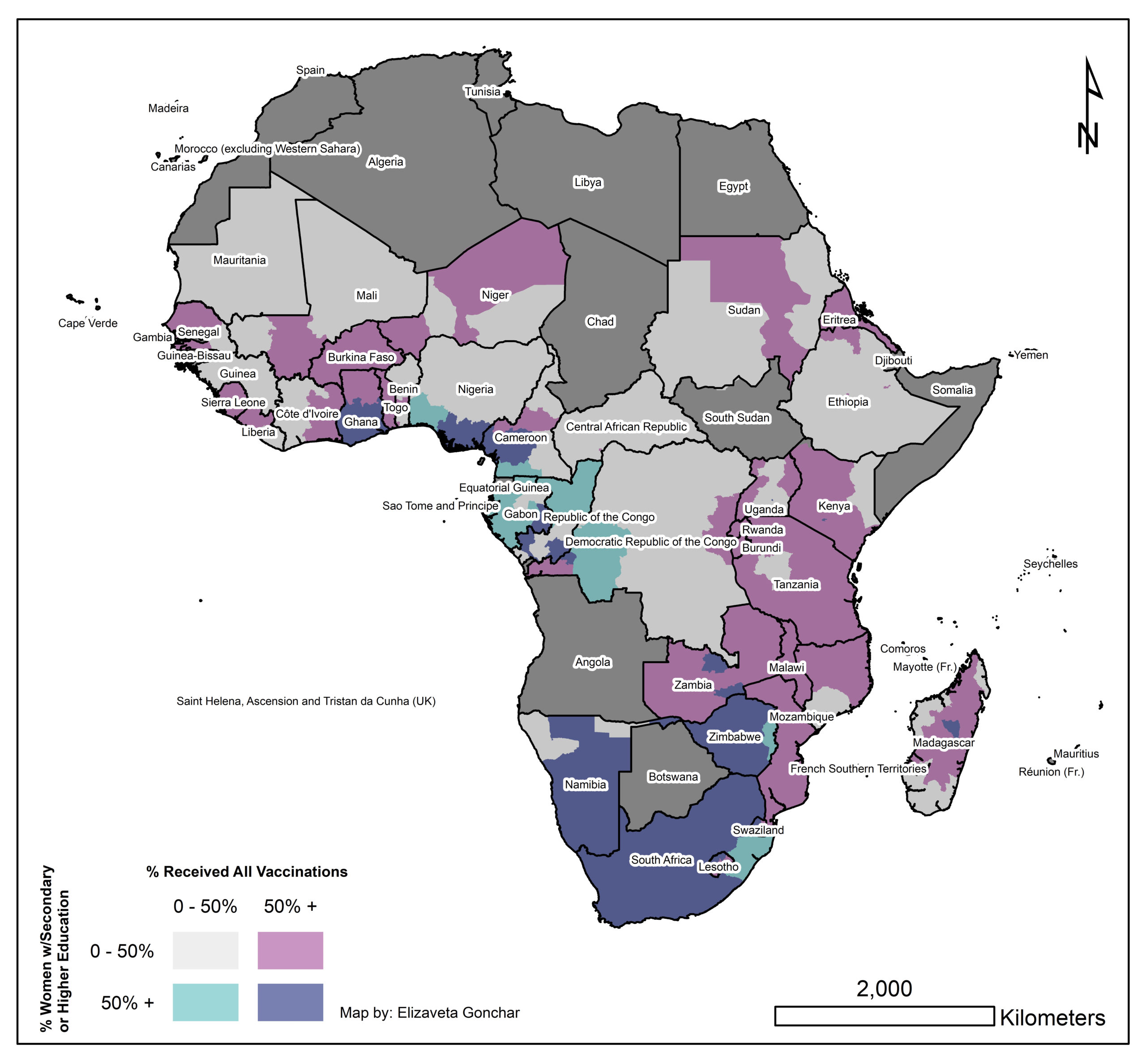
Bivariate map highlighting the relationship between vaccination rates and educational attainment of women in a sample of African countries.
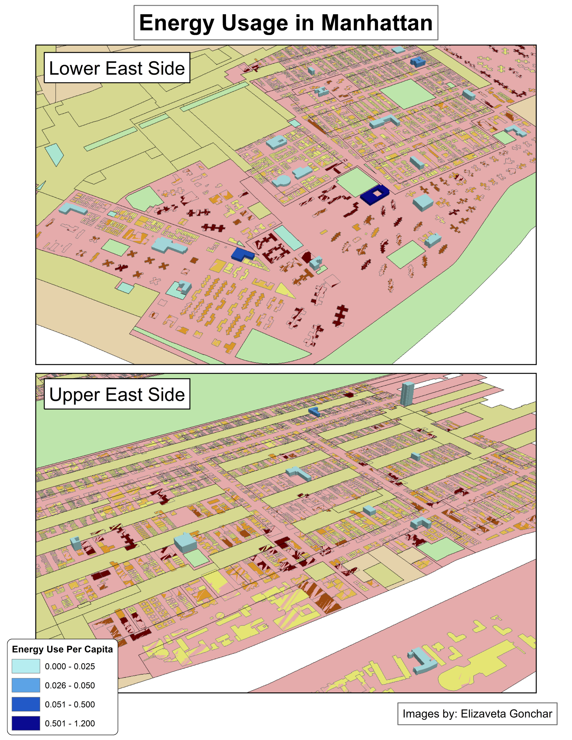
3D map of building in Manhattan, New York with colors indicating energy use per capita.
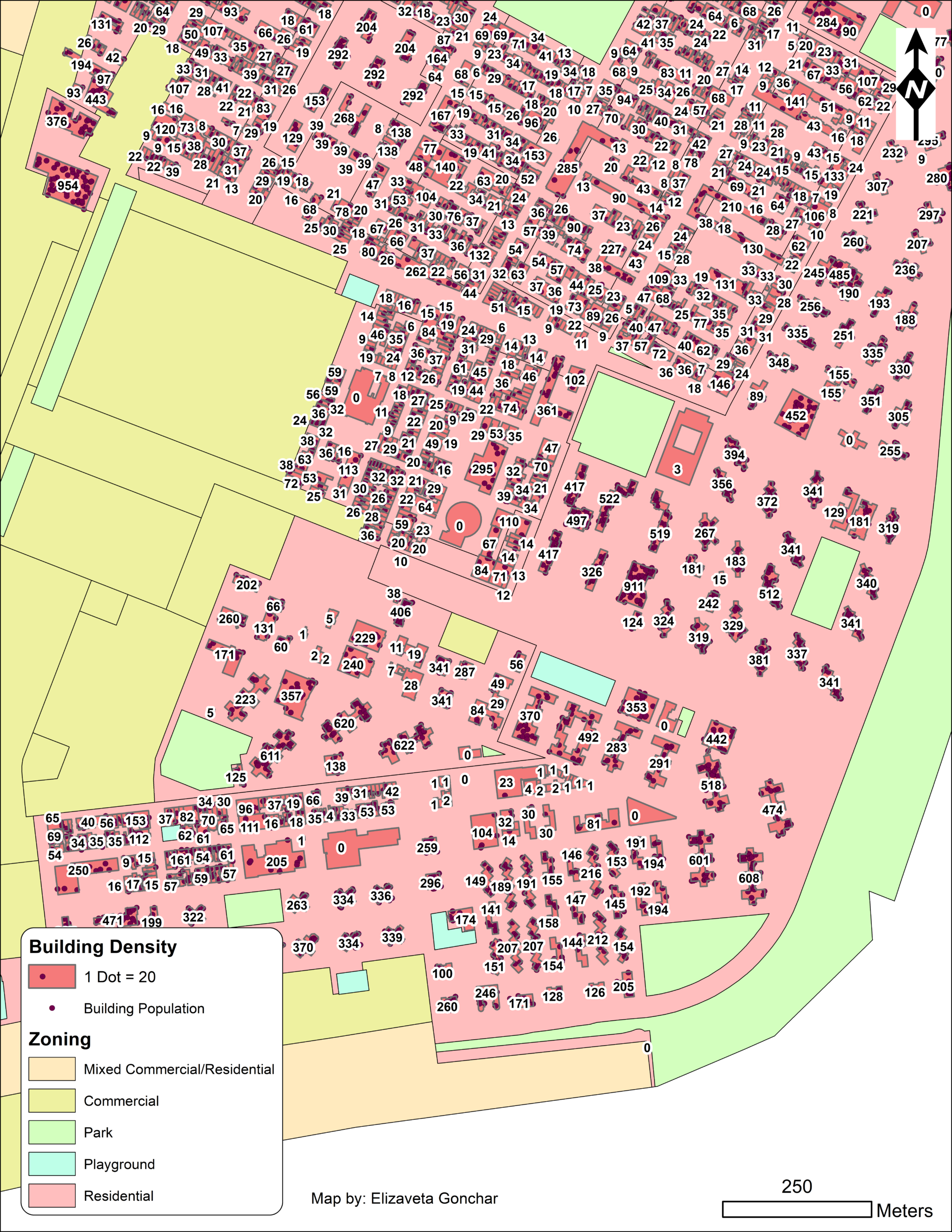
Presents building populations in a selected area of Manhattan in New York. Dot density symbology is used to present the number of people in each building.
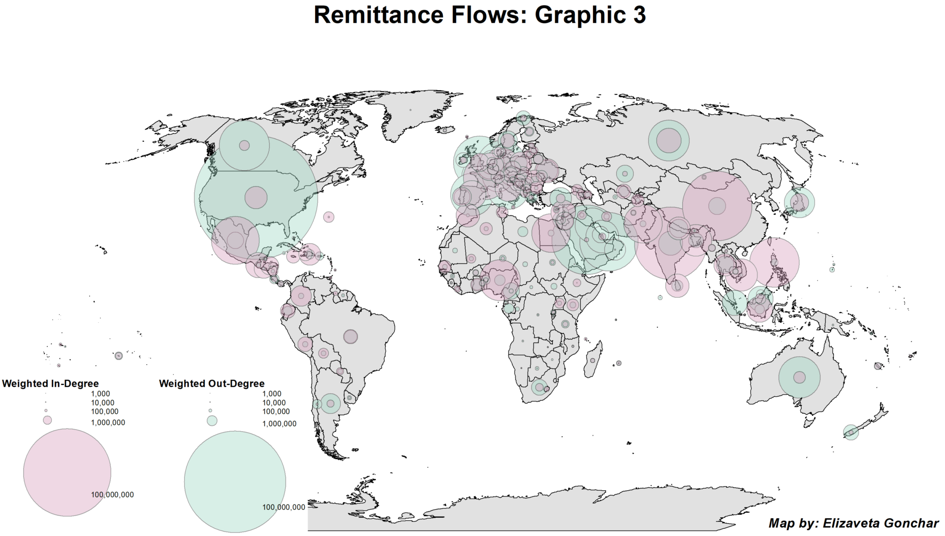
Depicts weighted in- and out-degrees of remittance flows by country in 2017.
GIS Day 2021 Map Submission – Competition Winner
Below is my submission for the GIS Day Competition 2021 run by the City Planning department at Georgia Tech.
GIS Projects
Site Suitability Analysis – Quinoa
I conducted this analysis for the Environmental GIS course (CP 6541) in Fall 2020 at Georgia Tech.
Change Detection – Remote Sensing
I conducted a change detection analysis for Hall County in Georgia (USA) for Introduction to Remote Sensing (CP 6531) in Fall 2020 at Georgia Tech.
Predicting Educational attainment
For my final project in the Advanced GIS course, I analyzed whether spatial disparities in educational attainment in St. Louis, Missouri can be forecasted, and what factors contribute to the outcomes. I implemented a geographically weighted regression (GWR) for my analysis. The intent of this paper is to provide motivation for policies that may be implemented to address inequality in educational outcomes in St. Louis.
Capturing Changes in the Vegetation of Crimea
For my final project in the Introduction to GIS course, I worked with Ian Helfrich to model the effects of the annexation of Crimea and subsequent shut off from access to water from Ukraine.
I recommend opening the Story Map in a new tab to see the final product in full.
Select Course Projects
Visualization For Planning – Group Project
Description of task:
Imagine your team is starting a new planning project, and your client, the municipality, wants a final deliverable of your analysis work, planning / design concepts and / or policy recommendations, supporting images, and narrative.
Item Response Theory Project
Description of task:
Research project completed for PSYC 8060 (Item Response Theory) at Georgia Tech. In this paper, I estimate the effect the creation of single-sex classes has via the change in the sex ratio of coeducational classes. For the analysis, I relied on the replication survey data provided by the authors and used IRTPRO.
Sentiment Analysis of Enron Emails
Description of task:
Research project completed for INTA 8803 (Big Data and Security) at Georgia Tech. For this project, I worked with Ian Helfrich to conduct a sentiment analysis of the Enron emails using Python.
Modeling Ukrainian Corruption
Description of task:
Presentation for a research project I completed for EC0N 626 (Game Theory) at Indiana University in Fall 2016. I proposed a model to capture corruption of Ukrainian politicians, incorporating the introduction of asset declarations of government officials in Ukraine.